
Identifying Outliers
Dean Adams, Michael Collyer, Antigoni Kaliontzopoulou & Mark A. Conaway
Introduction
All statistical analyses are sensitive to outliers. For instance, regression and most ordination approaches are heavily influenced by extremal data points, which can have a disproportionate leverage on the resulting statistical inferences. In GM data, one may have outliers for any number of reasons. First, specimens may be ‘true’ biological outliers; or there may be errors in digitizing (digitizing landmarks out of order is common); or any other number of reasons.
Geomorph provides a means of quickly identifying
outliers for further inspection, using the function
plotOutliers. Here we demonstrate its use, and provide a
visualization of the shape of a potential outlier (relative to the mean
shape), which aides in determining whether the outlier is something of
concern.
The function plots Procrustes distances (\(\small{D}_{Proc}\)) of all specimens relative to the mean. Large values are flagged as potential outliers, which can be subsequently inspected. Likewise, shape differences of outliers can be shown as well
Important Note! In order to use this function, one’s
data must be Procrustes aligned, using a Generalized Procrustes Analysis
(GPA). There is a separate tutorial on aligning specimens using the
geomorph function gpagen that can be found here.
plotOutliers() (Expand for more details)
- \(A\): A 2D or 3D array containing Procrustes shape variables for a set of specimens
- \(inspect.outliers\): A logical value (TRUE, or FALSE) indicating whether a plot(s) should be generated for outlying individuals comparing them to the consensus.
Note that for 3D specimens, the generated plot will be rendered in a separate window.
Input
Now let’s inspect for outliers in our plethodon
salamander dataset
plotOutliers(Y$coords, inspect.outliers = T)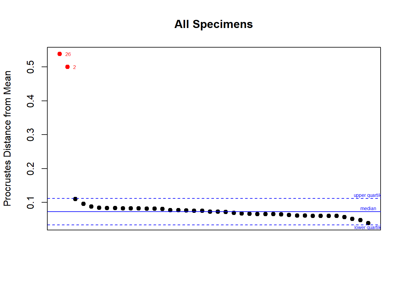
## 26  2 14 27  4 12  3  9  5 11  6 10 19 13 29  1 20  7 22 16 15 31 37 34 21 18 40 38 17  8 30 32 36 24 33 35 23
## 26  2 14 27  4 12  3  9  5 11  6 10 19 13 29  1 20  7 22 16 15 31 37 34 21 18 40 38 17  8 30 32 36 24 33 35 23
## 25 28 39
## 25 28 39
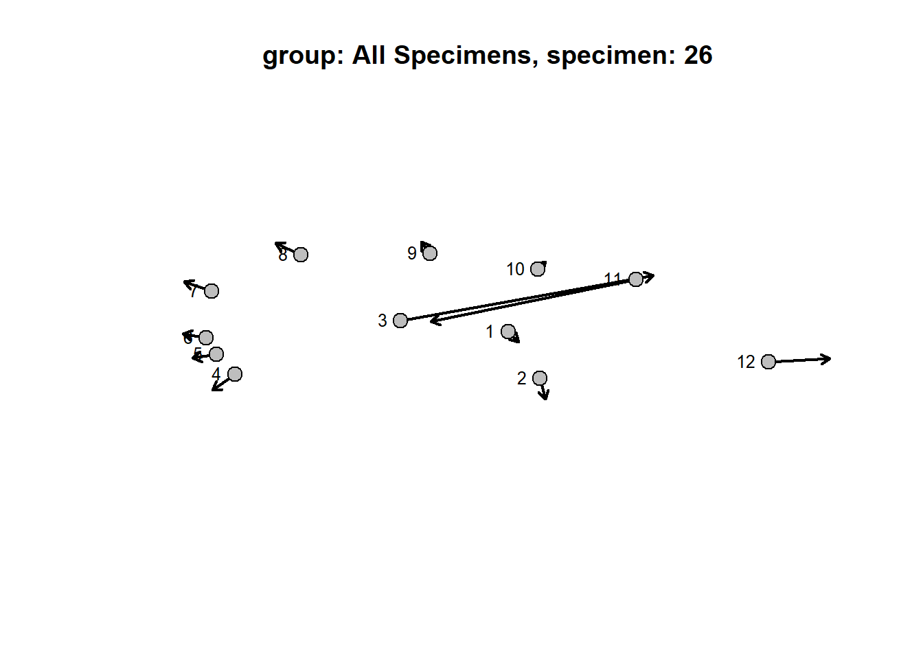
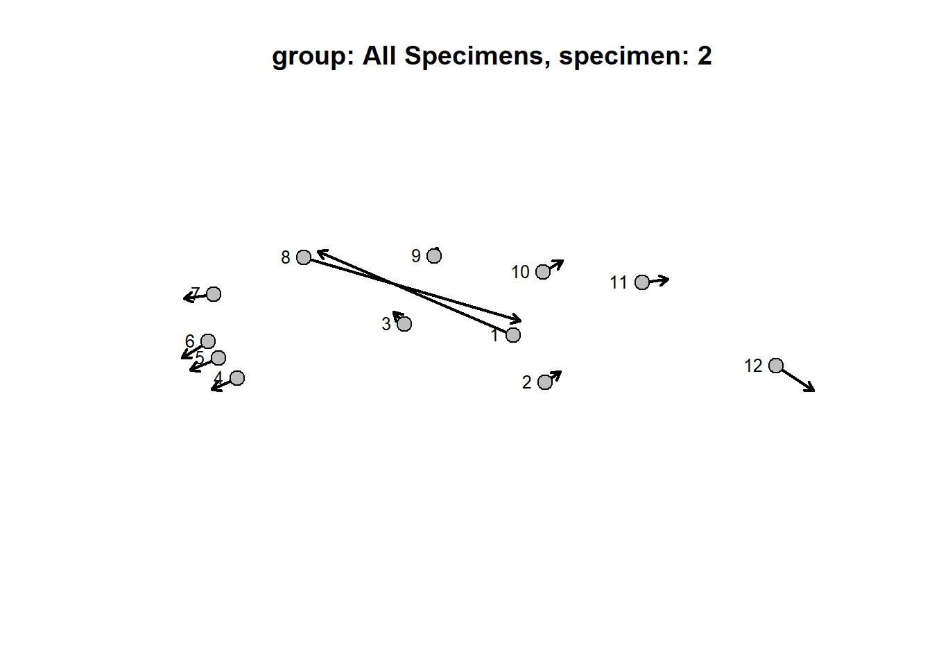
Here we have a plot of the shape distance of each specimen relative to the overall mean. Outliers (based on 95% CI) are shown in red. For this example we have two outliers. We can plot their shapes relative to the mean to reveal how their shape differs. Note that for three-dimensional data, outlying specimens will be visualized in a separate, interactive window.
Notice that landmark plots of the outliers relative to the mean show the problem. Several landmarks were digitized out of order. We can now go back and correct our data prior to downstream analyses.Note! Because the gpagen
function does not automatically reflect landmark coordinates, sided
elements that are a different side than the mean shape of a dataset
(i.e. a left femur within a group of right femora), will be flagged as
outliers.
Correcting Landmarking Errors in R
The above example shows us that we have evidently placed some landmarks out of order. In particular, on specimen number 2, the coordinates for what should be landmark 8 are listed under landmark 1 and vice versa; the same is the case for landmarks 3 and 11 on specimen number 26.This can be corrected in R like so:
newland[c(1,8),,2] <- newland[c(8,1),,2]
newland[c(3,11),,26] <- newland[c(11,3),,26]
Y <- gpagen(newland, print.progress = FALSE)
Now let’s try plotting the outliers again:
plotOutliers(Y$coords, inspect.outliers = T)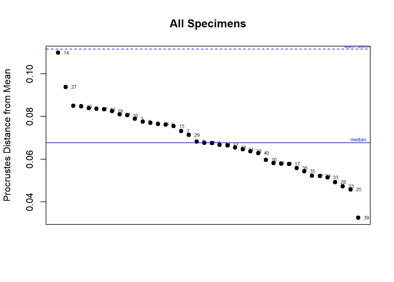
## 14 27  5 20  4 12 13 19 11 10  3  9  1 16  6 15  7 29  8 22  2 34 37 18 31 38 40 30 26 21 17 36 35 32 24 33 28
## 14 27  5 20  4 12 13 19 11 10  3  9  1 16  6 15  7 29  8 22  2 34 37 18 31 38 40 30 26 21 17 36 35 32 24 33 28
## 23 25 39
## 23 25 39